
English translation · coming soon
Last orders aren't in yet
An English patch for the Nintendo Switch release. It isn't out yet — this is where it'll land when it is.
- Script & database textdone
- Text fitting its boxesdone
- Text baked into texturesdone
- Playthrough: nitpicks, fonts, script editsfinal stage
A look inside
Recorded 10 October. Everything visible in it was fixed the same day. Watch on YouTube
A note from me
Apropos of having claude vomit claudian all over this page, I figured that my time is best spent working on the patch rather than updating this page. But reading AI text has a way of feeling worse than nothing, so here I am writing like a normal person.
A lot of work is being done on this patch actually. I spent 6 hours yesterday, 5 hours today. Mostly working on improving the image assets now that I've figured out how to interpret and edit the "layout" code of the game. Previously I was working in the "alloted" space that the sprite sheets gave me, which forced me to compromise in some ways that didn't feel good. So now that I'm free of that restriction I've been re-doing almost everything.
Having other people actually play the game is speeding things up considerably as well. I've set up a page where people can look up and flag any issues in the text, which speeds up the correcting/editing stage a lot. Some text needs to be restructured/rewritten to fit the available space in the dialogue box, but some of that could be solved by slightly shifting an icon to the side (such as the icon for replaying voice audio in the backlog). So I'm trying to do that before rewriting translations that I actually like
Progress update
The final stage
Text fitting is done and all the text baked into textures is done. We're playing through the game now, so what's left is nitpicking: shifting things a few pixels here and there, editing the script as we go, and some aesthetic choices.
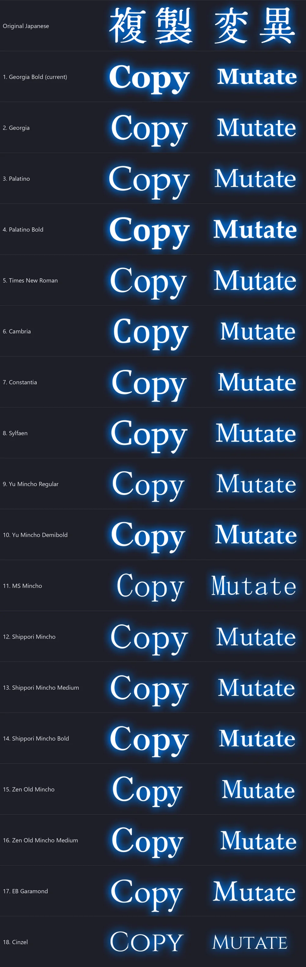
One of those is whether some screens get a different font. Nothing is decided yet, because it means deciding which screens use which font. These are some of the candidates, with the original Japanese at the top of each sheet:
The script, retranslated (9–10 Oct)
The first translation run didn't follow the method I specified at the start of the project: the text was sent line by line instead of as whole text boxes, so the same Japanese often came out worded differently, and sentences that run over two or three lines of a text box were translated in pieces. Once I found that out, the whole game was translated again according to the original specs: each text box, tutorial page and description sent as one piece, with a fixed list of game terms.
- Item, skill, effect and enemy names read the same everywhere; nicknames too (Yoi-tan, Cas-tan)
- Button and icon graphics inside the text checked against the Japanese
- Dialogue text drawn slightly smaller (85%) in all three dialogue windows, so lines fit their boxes
- Item, skill and gear effect descriptions rewritten as short menu text, using a third row where needed
- Cocktail descriptions shortened to fit three rows on the Drink Menu and the Cocktail Tree
- Links screen hint, World Map realm descriptions and “Move to Next Floor” made to fit
Textures (6–8 Oct)
The first English pass on the textures (September) used a heavy bold font in flat white. It lost some of the glow and the little ornaments around labels, and a few labels got cut off in game. These are redrawn in each label's own colour and glow, keeping the icons, slashes and ornaments where they were.
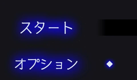
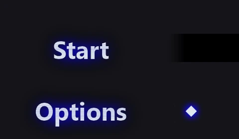
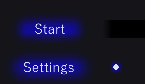
スタート / オプション → Start / Settings, in a thin face on the original blue glow.